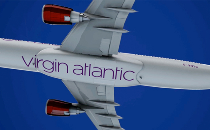
Johnson Banks refreshed the identity for Virgin Atlantic in 2010 after having researched and considered the way in which the brand is the 'most admired in the vast Virgin stable of companies'. The red tail fin was retained, but carefully redrawn to a 'much simpler and more elegant shape', the name was featured in full across all branded items and the design allowed careful manipulation to suit sub-brands and various flying classes available.
The new identity then, of course, had to be translated across all aircraft. Take a look at this amazing video show how it's done.


No comments:
Post a Comment